DollhouseMCP Style Guide
Design system and component library for the DollhouseMCP website
Colors
Our color palette includes brand colors, semantic colors, and a comprehensive neutral scale.
Brand Colors
Neutral Colors
Typography
Our type system uses system fonts for optimal performance and native feel.
Heading 1 - The quick brown fox
font-size: var(--font-size-5xl); font-weight: var(--font-weight-semibold);
Heading 2 - The quick brown fox
font-size: var(--font-size-4xl); font-weight: var(--font-weight-semibold);
Heading 3 - The quick brown fox
font-size: var(--font-size-3xl); font-weight: var(--font-weight-semibold);
Heading 4 - The quick brown fox
font-size: var(--font-size-2xl); font-weight: var(--font-weight-semibold);
Body text - The quick brown fox jumps over the lazy dog. This is how regular paragraph text appears in our design system.
font-size: var(--font-size-base); line-height: var(--line-height-normal);
Small text - Used for captions, labels, and secondary information.
font-size: var(--font-size-sm); color: var(--color-text-secondary);
Spacing
Consistent spacing scale for margins, padding, and gaps.
Buttons
Various button styles and sizes for different use cases.
Button Variants
Button Sizes
Cards
Card components for content grouping and presentation.
Card Header
This is a card body with some example content. Cards are great for grouping related information.
Simple Card
A card with just a body section, no header or footer.
Feature Card
Special card style for highlighting features with an icon.
Badges
Small labeling components for status and categorization.
Alerts
Contextual feedback messages for user actions and system states.
Forms
Form elements and input components.
This is helper text for the input field.
Please enter a valid email address.
Code Blocks
Styled code blocks for displaying code snippets.
Loading States
Loading indicators and progress components.
Progress Bar (60%)
Modal
Modal dialog for focused user interactions.
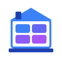
House Icons
Unique house icons extracted from the sprite sheet, available in multiple color schemes and sizes.
Basic House Icons
Blue
Rainbow
Purple
Green
Monochrome
Sizes
Small (32px)
Default (48px)
Large (64px)
Interactive & Animated
Hover Me!
Animated
Loading Effect
Retro Gaming Themes
Gameboy
Commodore 64
NES
Terminal
Modified House Icons (Organization Style)
Updated house icons with curved edges matching interior rooms and left-side chimney placement.
Official Organization Icon
Official PNG Icon
CSS Recreation Attempt
Best to use the PNG for accuracy
The official organization icon features:
- Blue gradient color scheme
- Left-side chimney placement
- Rounded corners matching interior rooms
- 4 rooms with purple gradient
- Clean, modern design
Original vs Modified Comparison
Original (Sharp Edges)
Standard
With Chimney
Modified (Curved Edges + Left Chimney)
Organization Icon
Rainbow Curved
Terminal Style Comparison
Original Terminal (Squashed)
Grid Layout (Squashed)
Modified Terminal (Lines)
Terminal Lines (with foundation)
Size Variations with Curved Edges
Small (32px)
Default (48px)
Large (64px)
Different Curve Intensities
Standard Curves
Soft Curves
Double Chimney
Grid System
Responsive grid layouts for organizing content.